UI Design + Understanding Elements of UI | CPE123 Week 8
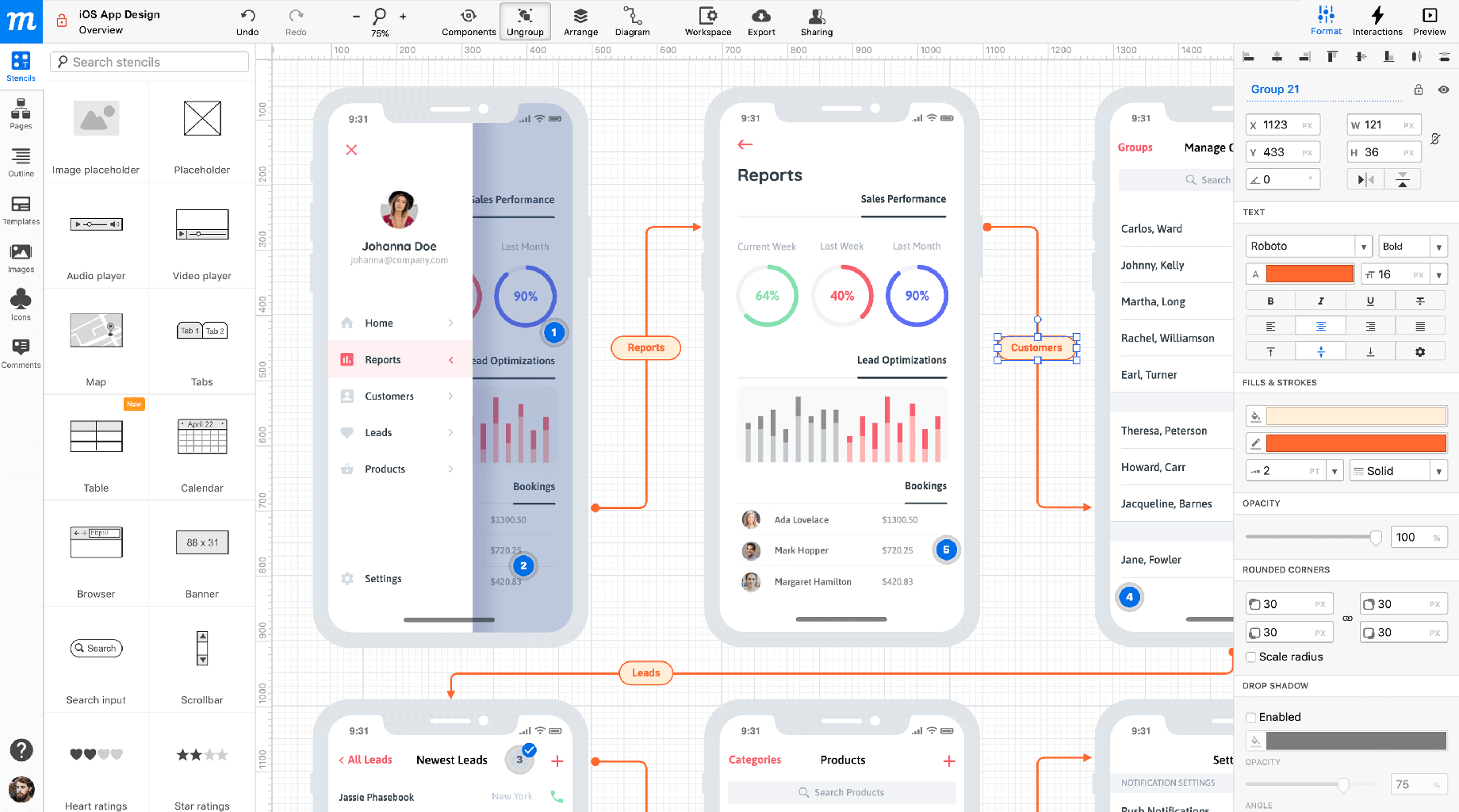
Prototype
(from : https://moqups.com/)
A prototype is a concrete but partial representation or construction of a system design.
It is used to demonstrate a concept to test the details of the concept as a specification for the final product.
It can be either paper, cardboard, or some suitable material like printing 3D but it have to be interactive.
It seeks to highlight functionality to evaluate your idea of design.
Presenting
How to Present design?
Presenting Design must be clear and appropriate.
The design process is involved to many people so it has to be suitable for everyone and when presenting you have to sort and select what to present.
When presenting you must focus on features because everybody has their own like.
Good and Bad UI
User Interfaces are the access point where users interact with the design.
They have to let users use minimum effort, no surprising action, the common features use common ways, and the minimum number of actions.
There are 3 formats
- Graphical user interfaces (GUIs) - that is visual representations on digital control panels.
- Voice-controlled interfaces (VULs) - that is voice interaction like smart assistants.
- Gesture-based interfaces - that is 3D design space like VR.
Carousel
Prioritize top tasks that are setting primary user goals on the screen.
- Who is the audience?
- Where do I send it on app or site?
- What call primary goal action?
- How are secondary goals related and how many goals?
Obey real-world rules - you can take some real-world physical effects but make sure it is consistent and sensible.
Sketch your ideas - you must always record when you have a meeting. You can use a simple one like representing by using a rectangle, circle, or triangle. Or can use complex ones like digital tools.
Patterns - you can reuse widgets that solve common problems to save you time. ( See at : https://ui-patterns.com/)
MAYA Principle - Most Advanced, Yet Acceptable.
Use Tabs effectively - you can use tabs when wanting to separate things that everybody knows the difference.
Clutter - used to clean up UI by hiding some info.
Lazy registration - you can try to connect an account with Facebook, google account, Twitter, etc. to less create an account.
Typography - fonts mean you have to choose fonts that fit your target.
The color palette - you have to set the theme of your app or site.
The feedback - you have to always see the feedback by filling out the form and when there is any error you have to immediately correct it.
* * * * * END * * * * *


Post a Comment
0 Comments